NOW TV
Communicating a new feature to existing customers
Focus on discoverability and comprehensibility
The important bits

When
2024
My role
UX Designer / Researcher
Tools
Figma | Miro | UserZoom
Timeframe
2 months
What was the project all about?
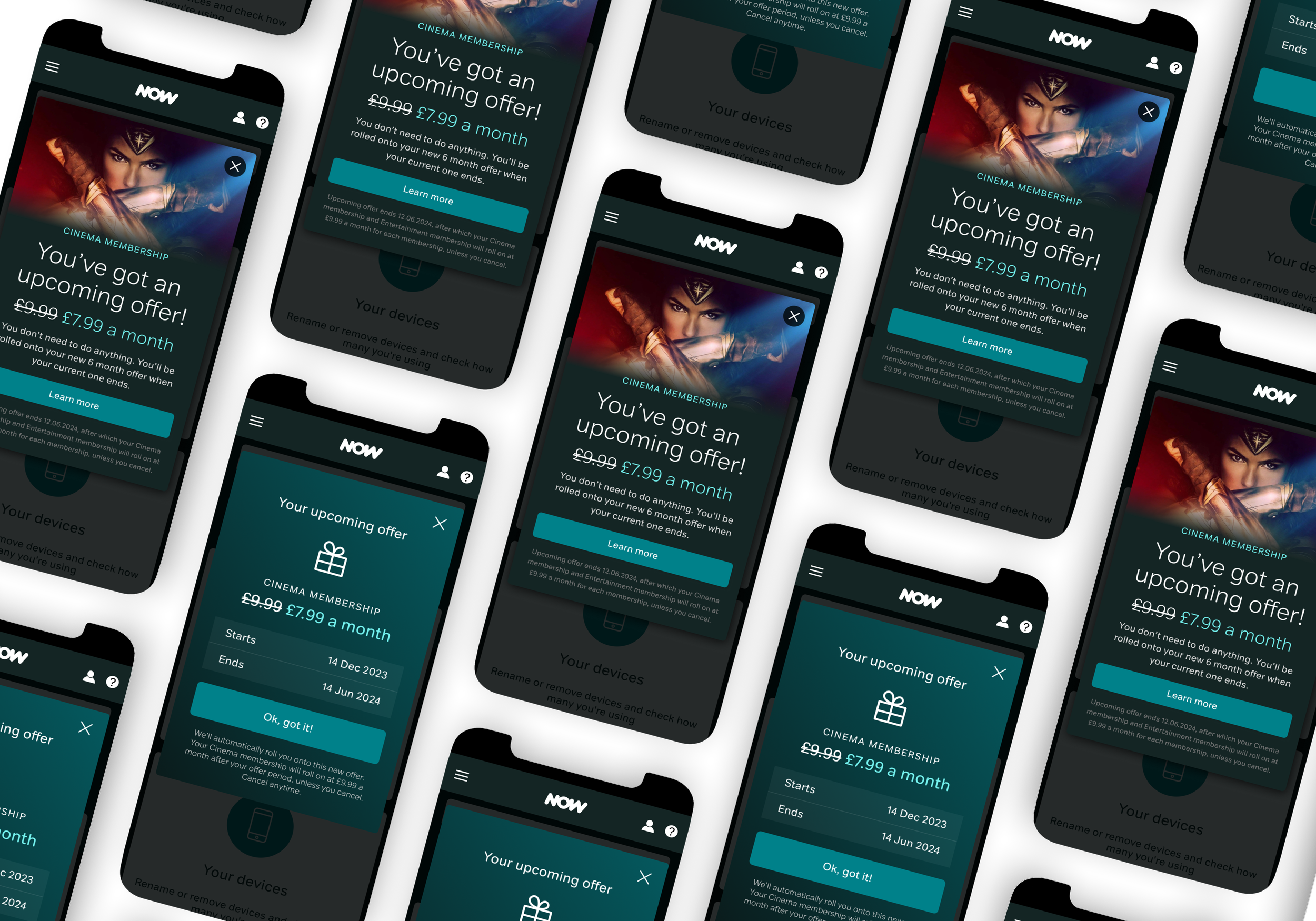
Dynamic offer queueing was a new feature allowing a future offer to be added to a customer’s account, aimed at preventing churn.
My role was to communicate effectively to NOW customers that they had an upcoming offer lined up, and to establish how and when to surface relevant information.
The brief
Find the best way to inform customers of this new queued offer feature, and signpost the information at appropriate moments during their journey.
What was the approach?

-
— With stakeholders to clarify project requirements and request additional data points
-
— To understand how competitors signpost offers and important value messaging
-
— Through individual work and group creative review sessions to critique ideas and generate new ways of thinking
-
— To gather feedback and validate designs
-
— Further iteration and final solutions, based on user feedback and business requirements
-
— To share final designs and communicate rationales and future recommendations
-
— Collaboration with developers and follow up sessions, to ensure successful design implementation
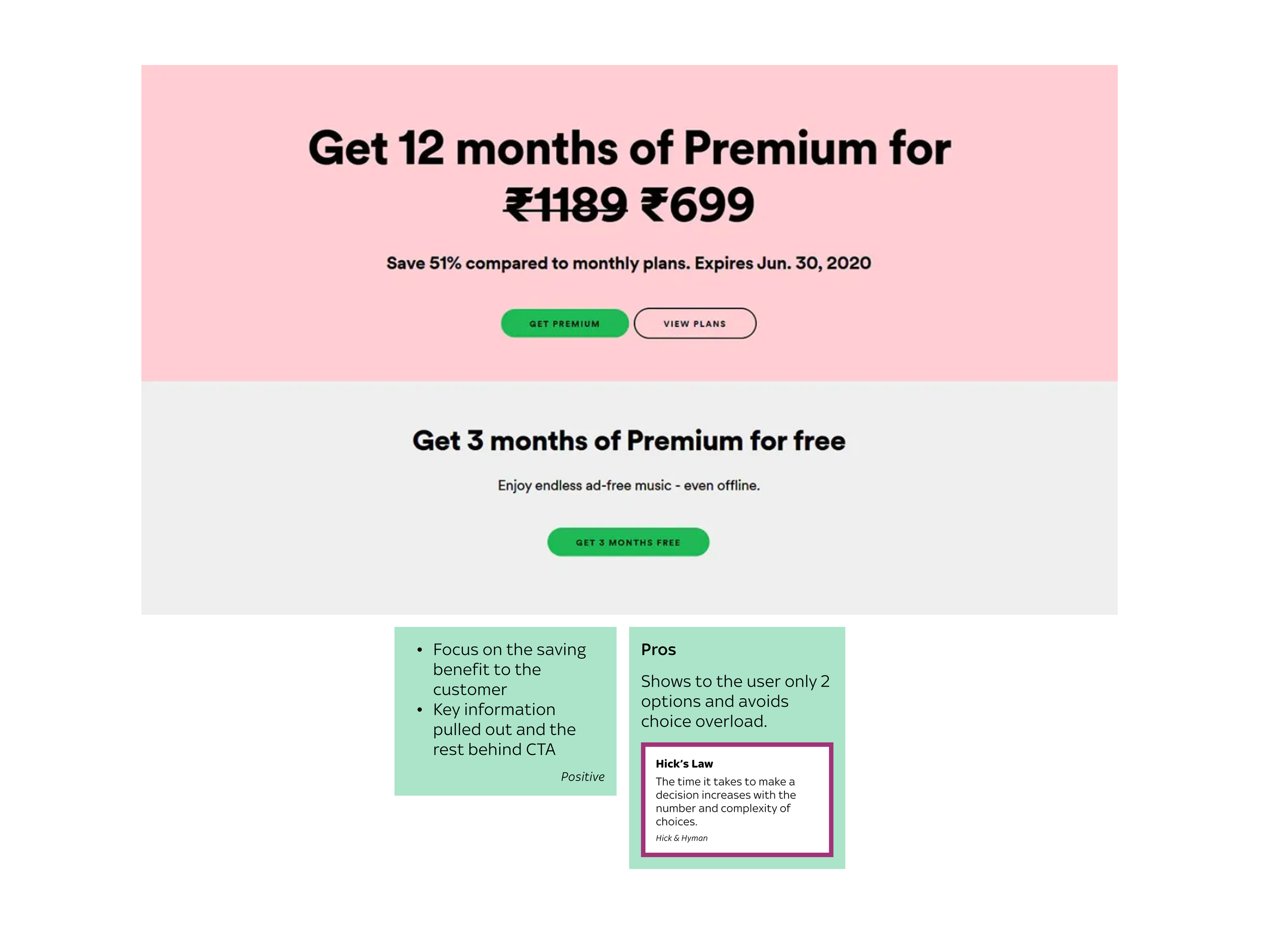
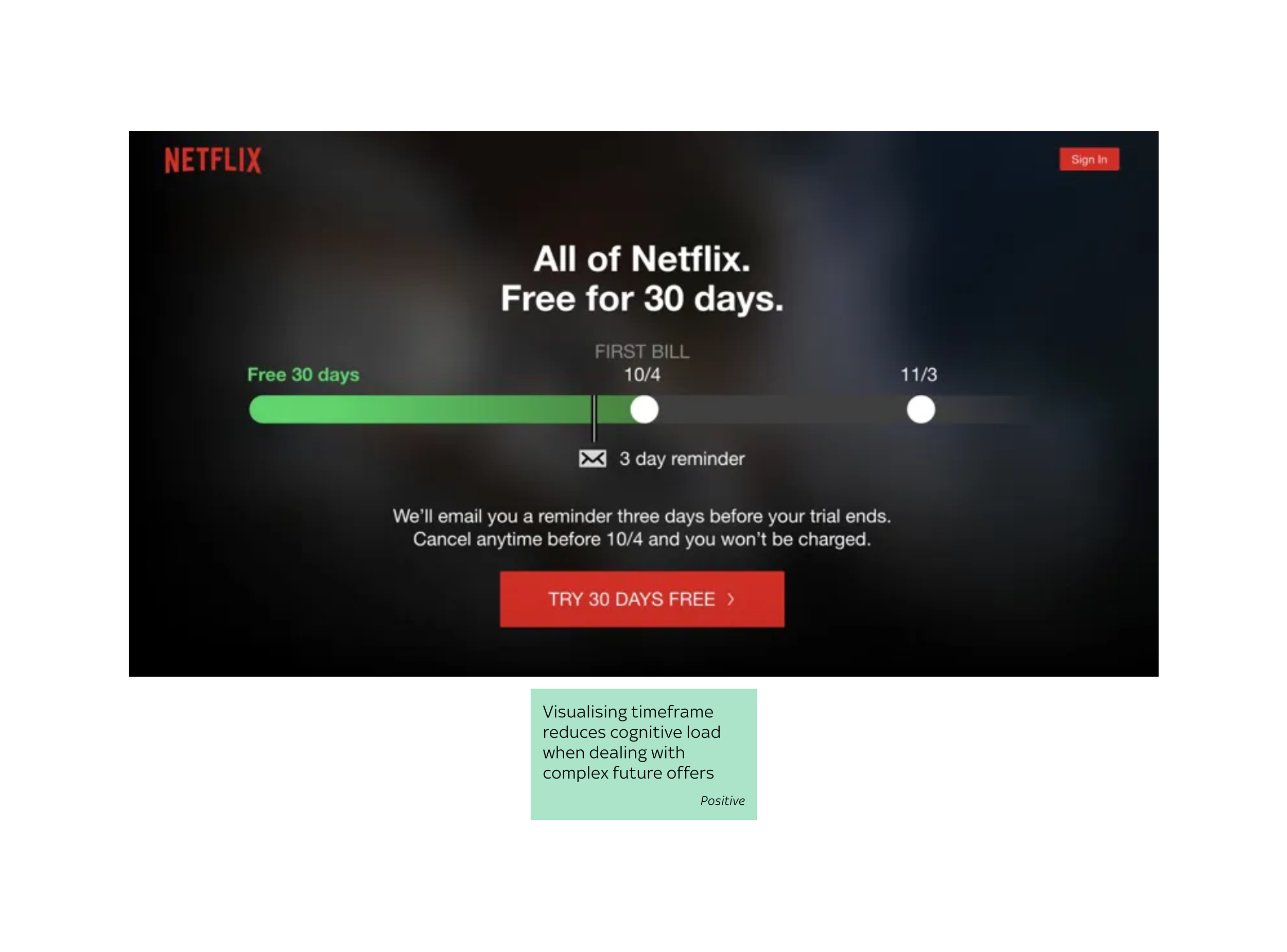
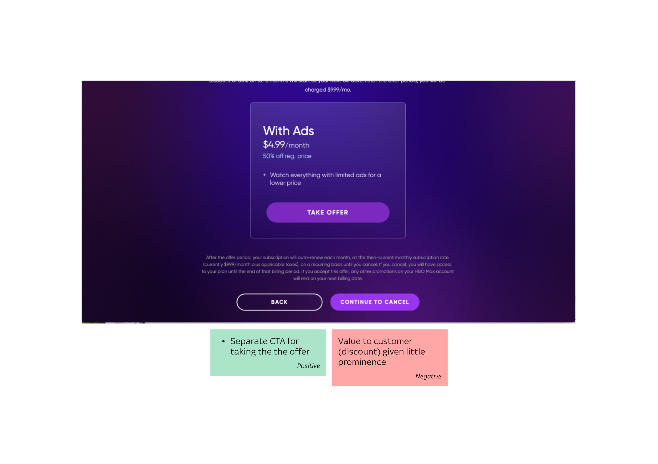
Competitor analysis
Doing some benchmarking to understand how direct and indirect competitors signpost offers and important value messaging to customers.

Design ideation


KEY HYPOTHESES TO TEST
Is the information discoverable?
•
Is the information comprehensible?
•
Is the information discoverable? • Is the information comprehensible? •
Time to put it in front of users…
We ran remote UserZoom sessions with interactive prototypes to discover whether the offer queueing information was discoverable and comprehensible.
Demographics
• 28 existing customers
• 45% female
• Aged 18-65
Devices and task
• Desktop and Mobile*
• Complete a cancellation journey
*More focus on mobile users because this is how 70% of NOW customers access My Account
A snapshot of user testing analysis


So what did we discover?
93% if participants found information in the popup modal to be discoverable and comprehensible.
1
An A/B test found the word ‘advert’ repeatedly used to describe the cinematic imagery, so an icon-led approach was recommended.
2

3
Cognitive load was too high on the retention offer page. A page design was considered but was out of scope for this project.
Queued offer information had already been surfaced multiple times by this point in the journey, so the recommendation was to remove the queued offer tile from this page.
4


Will O’Shea | Product Owner, Sky